Choosing a rug colour may seem like a simple decorating decision, but it can have a significant impact on the overall look and feel of a room. The right rug colour has the power to completely change how a space is perceived, influencing everything from mood and warmth to balance and visual flow.
In Australian homes, where natural light, open-plan layouts, and relaxed living are common, rug colour selection becomes even more important. A well-chosen rug can help define spaces, tie furniture together, and create a cohesive interior style without the need for major renovations.
Whether you’re working with a modern apartment, a coastal-inspired home, or a more classic interior, understanding how colour interacts with flooring, walls, furniture, and lighting will help you make a confident and long-lasting choice.
This guide will walk you through everything you need to consider when choosing the right rug colour for your home, including room-by-room advice, styling strategies, and common mistakes to avoid.
Why Every Room Needs a Rug
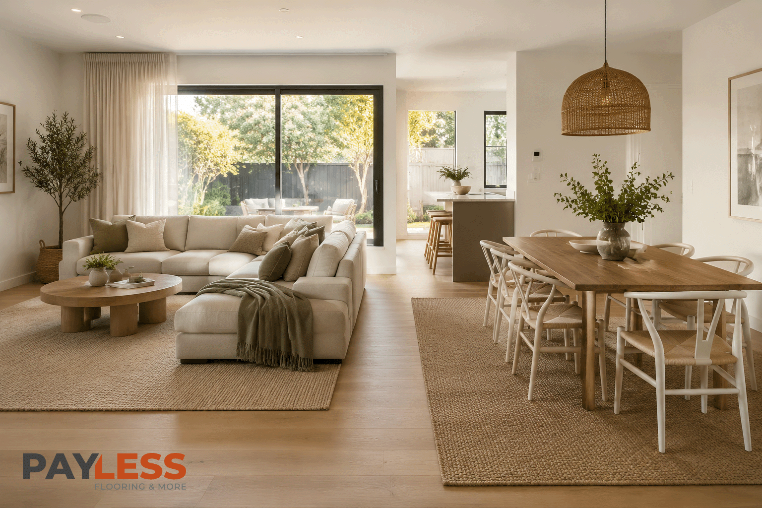
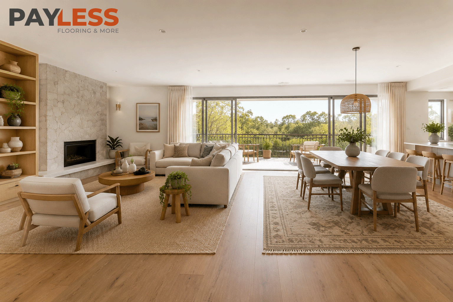
A rug does far more than simply cover a section of flooring. It helps create structure within a room, adds comfort underfoot, reduces noise, and introduces colour, texture, and personality into a space. In many Australian homes, particularly those with open-plan layouts, rugs play an important role in defining separate living zones without the need for physical walls.
A well-chosen rug can instantly make a room feel warmer and more inviting. It creates visual balance by connecting furniture pieces and helping them feel part of a cohesive arrangement. Without a rug, furniture can sometimes appear disconnected, especially in larger living areas where there is a significant amount of visible flooring.
Rugs also provide an opportunity to introduce colour in a controlled way. While changing wall colours or replacing furniture can be expensive and time-consuming, a rug offers a practical way to refresh a room’s appearance and add visual interest without major renovation work.
Creating Visual Balance
One of the primary functions of a rug is to anchor furniture and create a sense of balance. In living rooms, rugs help tie sofas, coffee tables, and armchairs together. In bedrooms, they add softness and comfort while visually grounding the bed within the room.
Adding Warmth and Comfort
Hard flooring remains extremely popular throughout Australia, particularly timber, engineered timber, laminate, and polished concrete. While these surfaces are practical and attractive, they can sometimes feel cold or echo-heavy. A rug introduces warmth, softness, and improved acoustics, making the room feel more comfortable and lived-in.
Enhancing Interior Design
Rugs can act as subtle supporting elements or bold statement pieces depending on the colour and design chosen. Whether you prefer coastal styling, modern minimalism, Hamptons elegance, or contemporary Australian interiors, the right rug colour helps reinforce the overall design direction.
Benefits of Adding a Rug
| Benefit | Impact |
|---|---|
| Defines spaces | Creates clear zones in open-plan homes |
| Adds comfort | Softer feel underfoot |
| Improves acoustics | Reduces echo and noise |
| Enhances style | Introduces colour and texture |
| Creates warmth | Makes rooms feel more inviting |
| Anchors furniture | Improves visual balance |
Consider the Location of the Rug
Before choosing a rug colour, it’s important to think about where the rug will be placed. Different rooms have different lighting conditions, traffic levels, and design requirements, all of which influence which colours will perform best.
The same rug colour can look dramatically different in a bright coastal living room compared to a darker hallway or bedroom. Understanding the location helps ensure the rug complements the space rather than working against it.
Living Rooms
Living rooms are often the largest and most frequently used spaces in the home. Here, the rug typically serves as a major design feature. Neutral colours remain popular in Australian homes because they create flexibility and work well with changing décor over time.
Lighter shades can help make a room feel larger and brighter, while darker tones may create a more grounded and sophisticated atmosphere.
Bedrooms
Bedrooms often benefit from softer and more calming colours. Gentle neutrals, warm earth tones, muted blues, and subtle greys can help create a relaxing environment that supports rest and comfort.
Dining Areas
In dining rooms, practicality becomes increasingly important. Medium-toned colours often perform well because they are more forgiving when it comes to minor spills and everyday wear.
Hallways and Entryways
These high-traffic areas generally benefit from colours and patterns that help conceal dirt and foot traffic. Rugs in entryways should balance style with practicality, particularly in busy family homes.
Choosing Rug Colours by Location
| Room | Recommended Colour Direction |
|---|---|
| Living Room | Neutral, earthy, or statement colours |
| Bedroom | Soft and calming tones |
| Dining Room | Mid-toned practical colours |
| Hallway | Patterned or darker shades |
| Entryway | Durable colours that hide wear |
| Home Office | Balanced, distraction-free tones |
Start with the Mood of Your Room
One of the easiest ways to choose a rug colour is to begin with the atmosphere you want to create. Colour has a powerful influence on mood, and the rug often occupies a large visual area within a room, making it one of the most influential design elements.
Rather than selecting a colour based purely on trends, think about how you want the room to feel when you spend time in it.
Creating a Calm and Relaxed Space
Soft neutrals, warm beiges, greys, ivory tones, and muted earthy colours create a sense of calm and openness. These colours are particularly popular in contemporary Australian interiors because they complement natural materials and abundant daylight.
Creating Warmth and Cosiness
If your goal is to make a room feel more intimate and welcoming, deeper tones can be highly effective. Warm browns, terracotta shades, olive greens, and rich charcoal colours add depth and character without overwhelming the space.
Creating Energy and Personality
Some homeowners prefer a more vibrant atmosphere. Rugs featuring bold colours, artistic patterns, or strong contrasts can become statement pieces that bring energy and individuality into a room.
Mood-Based Rug Colour Guide
| Desired Mood | Recommended Colours |
|---|---|
| Calm and peaceful | Beige, ivory, soft grey |
| Warm and cosy | Terracotta, taupe, brown |
| Fresh and airy | Cream, sand, light blue |
| Sophisticated | Charcoal, navy, deep grey |
| Energetic | Bold patterns and colour accents |
| Contemporary | Neutral layered tones |
Match the Rug to Your Interior Style
The colour of your rug should support the overall design style of your home rather than compete with it. While personal preference always matters, choosing a rug colour that complements your interior style helps create a more cohesive and professionally styled space.
In Australian homes, interior design often combines practicality with relaxed living. Whether your home leans towards coastal, Hamptons, contemporary, Scandinavian, industrial, or classic styling, the rug colour can either strengthen the design direction or disrupt the visual flow if chosen poorly.
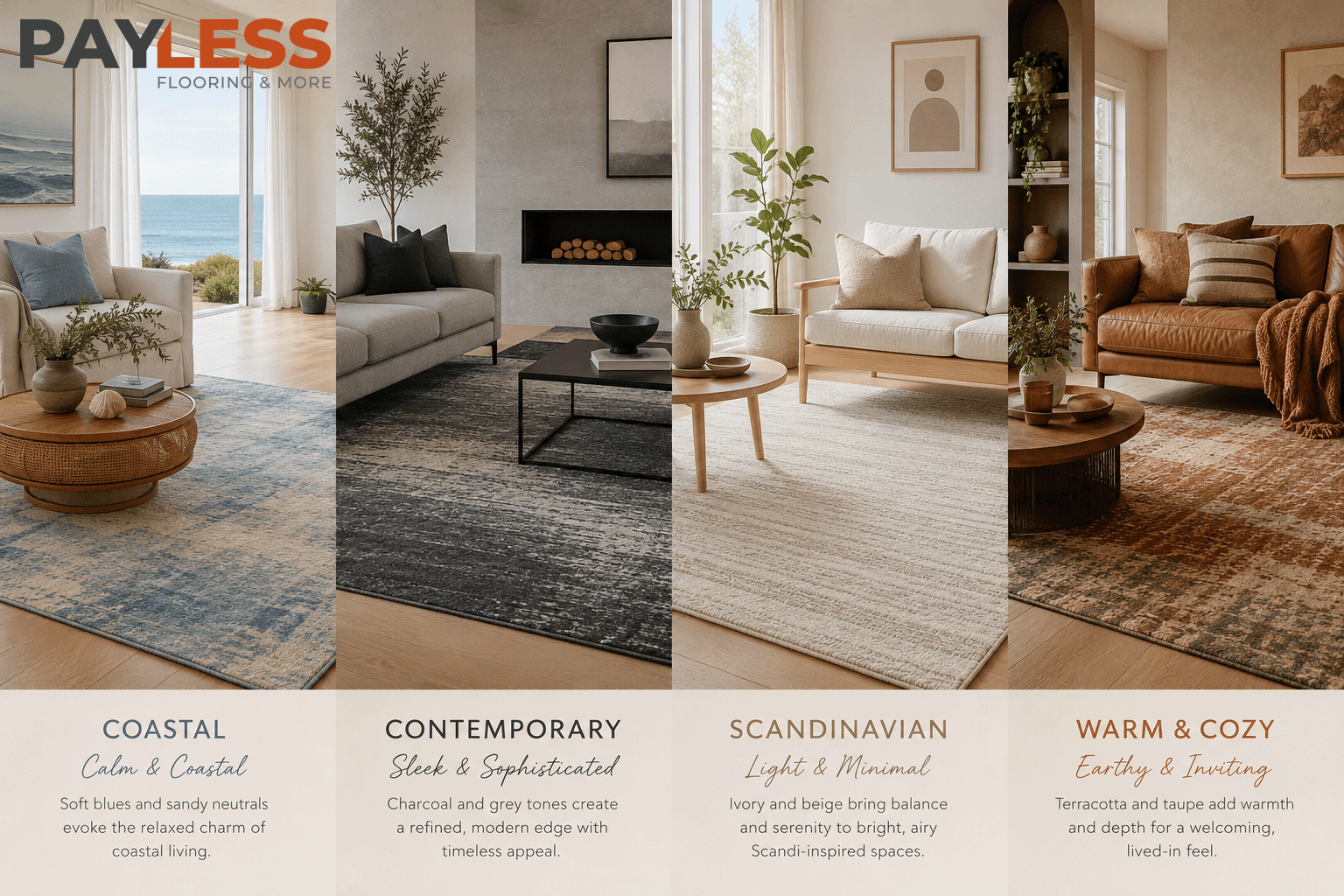
Coastal Interiors
Coastal-inspired homes remain one of the most popular interior styles across Australia. These spaces are typically bright, airy, and influenced by natural materials and beachside environments.
Rug colours that work well in coastal interiors include soft whites, sandy beiges, light greys, muted blues, and subtle earthy tones. These colours reflect natural landscapes and help maintain a relaxed atmosphere.
Contemporary and Modern Interiors
Modern interiors often focus on clean lines, minimal clutter, and balanced colour palettes. In these spaces, rugs are frequently used to introduce texture rather than strong colour contrast.
Neutral tones such as charcoal, grey, taupe, beige, and soft ivory remain popular choices. For homeowners seeking a more dramatic look, monochrome rugs or subtle geometric patterns can add visual interest without overwhelming the room.
Hamptons Style Homes
Hamptons interiors combine elegance with comfort. Rug colours in these spaces often feature layered neutrals, soft blues, navy accents, and classic patterns that contribute to the timeless appeal of the style.
Scandinavian Design
Scandinavian-inspired homes prioritise simplicity, light, and functionality. Rug colours are generally understated, featuring soft greys, off-whites, light beige tones, and muted earthy shades that support a clean and uncluttered environment.
Interior Style and Rug Colour Guide
| Interior Style | Recommended Rug Colours |
|---|---|
| Coastal | Sand, ivory, soft blue |
| Contemporary | Grey, charcoal, taupe |
| Hamptons | Navy, ivory, soft neutrals |
| Scandinavian | White, light grey, beige |
| Industrial | Charcoal, concrete grey, black |
| Classic | Rich neutrals, traditional tones |
Consider Light & Flooring
Natural light and flooring colour have a major influence on how a rug colour appears once it is placed in a room. A colour that looks perfect in a showroom may appear completely different under your home’s lighting conditions.
Before choosing a rug colour, consider both the amount of natural light the room receives and the colour tone of the flooring beneath it.
Understanding Natural Light
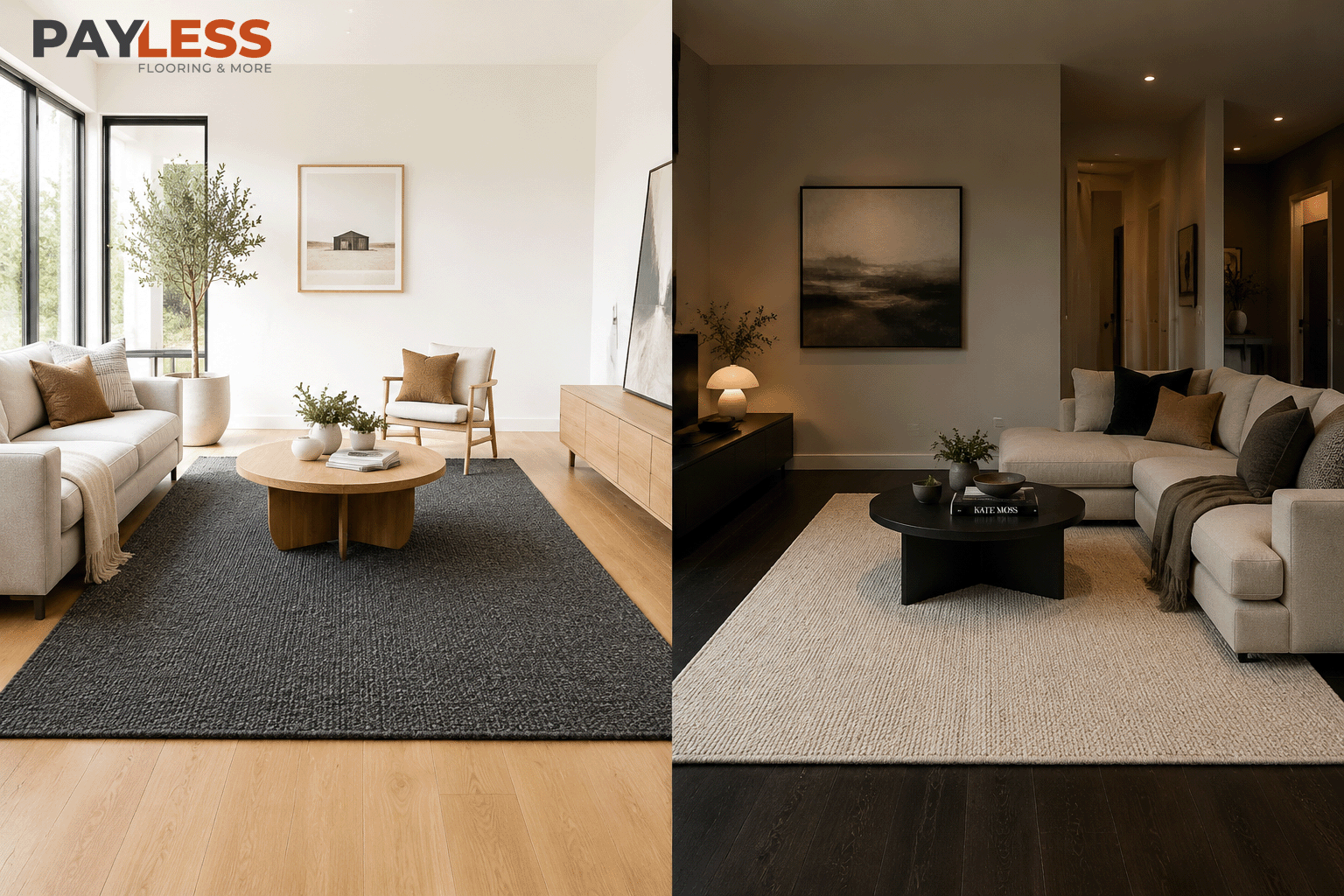
Rooms with large windows and abundant natural light tend to make colours appear brighter and more vibrant. In these spaces, darker rugs can create welcome contrast and help anchor the room.
Rooms with limited natural light may benefit from lighter-coloured rugs that reflect available light and make the space feel more open.
Matching Rug Colours to Light Flooring
Light timber flooring, pale oak, and blonde timber are common throughout Australian homes. These floors pair well with both light and dark rugs, offering considerable flexibility.
Neutral rugs help maintain a bright aesthetic, while darker rugs introduce contrast and definition.
Matching Rug Colours to Dark Flooring
Dark timber floors often create a sophisticated look but can sometimes make a room feel heavier. Lighter rugs help balance the space and prevent the room from appearing overly dark.
Flooring and Rug Colour Guide
| Flooring Colour | Recommended Rug Colours |
|---|---|
| Light Timber | Grey, beige, charcoal |
| Medium Timber | Ivory, taupe, soft grey |
| Dark Timber | Cream, sand, light beige |
| Concrete Floors | Grey, charcoal, earth tones |
| White Flooring | Almost any colour palette |
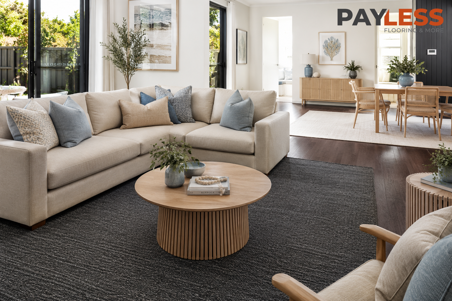
Use Colour to Zone Open Spaces
Open-plan living has become a defining feature of modern Australian homes. While these layouts create flexibility and improve natural light flow, they can sometimes lack clear boundaries between functional areas.
Rugs provide one of the easiest ways to visually separate spaces without introducing walls or partitions.
Defining Living Areas
A rug placed beneath a sofa arrangement instantly signals the living zone within a larger open-plan space. Colour can further strengthen this separation.
For example, a warmer-toned rug can create a cosy lounge area, while cooler tones may help distinguish an adjacent workspace.
Separating Dining Spaces
Dining areas often benefit from a rug colour that complements, but does not exactly match, the living room rug. This creates distinction while maintaining visual harmony throughout the home.
Creating Cohesion Across Zones
When using multiple rugs in an open-plan layout, it is generally helpful to repeat certain colours or tones throughout the space. This prevents the zones from feeling disconnected.
Rug Colour Zoning Guide
| Zone | Colour Approach |
|---|---|
| Living Area | Warm, grounding colours |
| Dining Area | Complementary neutral tones |
| Reading Corner | Soft calming colours |
| Home Office | Focused, muted tones |
| Multi-Use Space | Coordinated colour palette |
How to Match Rug Color: 4 Strategies
Choosing a rug colour becomes much easier when you follow a clear strategy. Rather than selecting colours at random, professional interior designers typically use one of several proven approaches.
Strategy 1: Match Existing Furniture
One of the simplest methods is to choose a rug colour that echoes colours already present in the room. This may include sofas, armchairs, cushions, or artwork.
This approach creates a cohesive and balanced appearance without requiring major design changes.
Strategy 2: Create Contrast
Sometimes the best rug colour is one that intentionally contrasts with surrounding elements. A darker rug on light flooring or a light rug on dark flooring creates visual interest and helps define the space.
Strategy 3: Use a Neutral Foundation
Neutral rugs remain popular because they provide flexibility. They allow homeowners to change furniture, accessories, and wall colours without needing to replace the rug.
Strategy 4: Make the Rug the Feature
In some rooms, the rug becomes the statement piece. Bold colours, artistic designs, and patterned rugs can inject personality and become the visual focal point of the space.
Rug Colour Matching Strategies
| Strategy | Result |
|---|---|
| Match furniture | Cohesive appearance |
| Create contrast | Strong visual impact |
| Neutral foundation | Maximum flexibility |
| Statement rug | Bold focal point |
Matching Rug Colors to Wall and Floor Tones
One of the most effective ways to choose a rug colour is to consider the existing colours already present in the room. Walls and flooring typically occupy the largest visual areas within a space, so the rug should work alongside them rather than feeling disconnected.
The goal is not necessarily to create a perfect colour match. Instead, the rug should complement the overall palette while adding depth, balance, and visual interest.
Working with Neutral Walls
Neutral walls remain extremely popular in Australian homes because they provide flexibility and create a timeless backdrop for furniture and décor.
White, off-white, warm beige, and soft grey walls allow homeowners to experiment with a wider range of rug colours. Depending on the desired look, the rug can either blend seamlessly into the space or introduce a stronger contrast.
Coordinating with Warm Wall Tones
Walls featuring warmer undertones pair well with rugs in earthy colours such as taupe, sand, terracotta, olive, and warm greys. These combinations create a welcoming and cohesive environment.
Coordinating with Cool Wall Tones
Rooms featuring cooler wall colours often benefit from rugs in charcoal, soft grey, muted blue, or neutral shades that reinforce the calm and contemporary atmosphere.
Matching Rugs to Floor Tones
The flooring colour influences how a rug appears more than many homeowners realise. A rug that looks perfect against one floor colour may appear completely different when placed on another surface.
Wall and Floor Colour Matching Guide
| Wall or Floor Tone | Recommended Rug Colours |
|---|---|
| White Walls | Almost any colour palette |
| Warm Beige Walls | Sand, taupe, olive |
| Cool Grey Walls | Charcoal, grey, blue |
| Light Timber Floors | Beige, charcoal, ivory |
| Medium Timber Floors | Soft grey, cream, taupe |
| Dark Timber Floors | Light neutrals, ivory |
| Concrete Floors | Earth tones, charcoal |
How to Choose the Color of the Rug for the Living Room
The living room is often the largest and most frequently used area in the home, making rug colour selection particularly important. Because the rug typically occupies a significant amount of floor space, it can dramatically influence the room’s atmosphere.
Decide Whether the Rug Should Stand Out
One of the first decisions is whether the rug should be a feature or a supporting element. A feature rug introduces personality and becomes a focal point, while a supporting rug quietly complements the furniture and décor.
Consider Lifestyle Requirements
Family homes with children and pets often benefit from practical mid-tone colours that help conceal everyday wear. Very light rugs may show dirt more easily, while extremely dark rugs can highlight dust and pet hair.
Think About Long-Term Flexibility
Many Australian homeowners prefer neutral rug colours because they allow furniture and styling updates over time without requiring a complete redesign of the space.
Living Room Rug Colour Guide
| Desired Look | Recommended Colours |
|---|---|
| Bright and airy | Ivory, cream, sand |
| Warm and inviting | Taupe, terracotta, beige |
| Modern and sleek | Grey, charcoal |
| Coastal inspired | Soft blue, beige, white |
| Bold statement | Navy, patterned designs |
| Timeless style | Neutral layered tones |
Matching Rug and Sofa
The relationship between the sofa and the rug is one of the most important design decisions in a living room. Since these are often the two largest visual elements in the space, their colours should feel intentionally connected.
Matching Similar Tones
A rug that shares similar tones with the sofa creates a calm and harmonious appearance. This approach works particularly well in minimalist and contemporary interiors.
Using Contrast Effectively
Contrast can create visual interest and prevent the room from feeling flat. For example, a light sofa can be paired with a darker rug, while a charcoal sofa may benefit from a lighter neutral rug.
Coordinating Rather Than Matching
The most successful interiors often coordinate colours rather than matching them exactly. Repeating complementary shades throughout cushions, artwork, and accessories helps tie the room together naturally.
Sofa and Rug Colour Pairings
| Sofa Colour | Recommended Rug Colours |
|---|---|
| White | Beige, grey, navy |
| Beige | Ivory, taupe, charcoal |
| Grey | Cream, charcoal, blue |
| Charcoal | Ivory, sand, light grey |
| Navy | Cream, beige, soft grey |
| Brown | Taupe, olive, warm neutrals |
Matching Rug and Floor
Many homeowners wonder whether their rug should match the floor colour. In most cases, an exact match is not necessary and may even reduce visual depth.
The goal is usually to create enough contrast so the rug stands out while still feeling connected to the room.
Creating Contrast with Flooring
Contrast helps define the rug’s shape and ensures it remains visually distinct from the floor beneath it. This is particularly important when working with timber flooring.
Working with Timber Floors
Australian homes frequently feature timber flooring in a range of finishes. The rug colour should complement the timber’s undertones rather than clash with them.
Maintaining Visual Balance
A room with very dark flooring often benefits from lighter rugs, while lighter flooring can support both dark and light rug options depending on the desired effect.
Rug and Floor Colour Guide
| Floor Colour | Suitable Rug Colours |
|---|---|
| Light Oak | Grey, beige, charcoal |
| Natural Timber | Ivory, taupe, soft blue |
| Walnut | Cream, sand, light grey |
| Dark Timber | Ivory, beige, cream |
| Concrete | Charcoal, taupe, earth tones |
| White Floor | Almost any rug colour |
Color Combinations for Every Room
Different rooms often benefit from different colour combinations depending on their function and atmosphere. While there are no strict rules, certain combinations consistently perform well in Australian interiors.
Living Room Combinations
Living rooms generally benefit from balanced combinations that create warmth without overwhelming the space.
Bedroom Combinations
Bedrooms often work best with softer palettes that promote relaxation and comfort.
Dining Room Combinations
Dining spaces can accommodate slightly richer colours because they are typically used for shorter periods and benefit from a sense of intimacy.
Home Office Combinations
Workspaces often perform best with calming neutral colours that encourage focus without distraction.
Room-by-Room Colour Combination Guide
| Room | Recommended Combination |
|---|---|
| Living Room | Beige and grey |
| Living Room | Ivory and charcoal |
| Bedroom | Soft grey and cream |
| Bedroom | Sand and muted blue |
| Dining Room | Taupe and terracotta |
| Dining Room | Beige and olive |
| Home Office | Grey and natural timber |
| Home Office | Charcoal and ivory |
| Entryway | Taupe and charcoal |
| Open-Plan Space | Layered neutral tones |
Mistakes to Avoid When Choosing the Color of the Rug
Selecting the right rug colour can elevate an entire room, but certain mistakes can make even a high-quality rug feel out of place. Understanding these common pitfalls can help homeowners make more confident and practical design decisions.
Choosing a Rug Before Finalising Furniture
One of the most common mistakes is purchasing a rug before key furniture pieces have been selected. Since the rug needs to work with sofas, chairs, tables, and décor, choosing it too early can make coordination more difficult later.
Ignoring Natural Light
A rug colour can look dramatically different depending on how much natural light enters the room. Colours often appear brighter in sun-filled spaces and darker in rooms with limited daylight. Always consider lighting before final decision.
Following Trends Too Closely
Trend-based colours may look good now but not always long-term. It’s better to choose a rug colour that matches your interior style rather than short-term fashion.
Choosing Colours That Are Too Similar
If rug and floor colours are too close, the rug can disappear visually. A bit of contrast helps define the space better.
Overlooking Maintenance Requirements
Light rugs show stains more easily, while very dark rugs can show dust and pet hair. Always match colour with lifestyle.
Common Rug Colour Mistakes Table
| Mistake | Result |
|---|---|
| Buying before furniture | Poor coordination |
| Ignoring lighting | Wrong colour appearance |
| Following trends only | Short lifespan style |
| Matching floor exactly | No visual depth |
| Wrong colour choice for lifestyle | Hard maintenance |
CAN YOU HAVE DIFFERENT COLORS ON THE RUGS IN THE SAME ROOM?
Yes, you can use different rug colours in the same room if done correctly. In modern Australian interiors, this is actually a growing trend, especially in open-plan homes.
Keep Colours in the Same Family
Rugs don’t need to match exactly, but they should feel connected. Similar undertones or complementary shades work best.
Use Rugs to Define Zones
Different rug colours can separate living, dining, or reading areas inside one large room without walls.
Maintain Visual Harmony
Even if colours differ, textures, materials, or patterns should stay consistent to avoid a messy look.
Multi-Rug Colour Guide
| Approach | Result |
|---|---|
| Same colour family | Balanced look |
| Complementary tones | Stylish contrast |
| Same texture style | Cohesion |
| Different colours + same theme | Zoned design |
| Random colours | Visual clutter |
Conclusion: Finding Your Perfect Rug Color
Choosing the right rug colour is about balance, lifestyle, and overall interior harmony. Instead of focusing only on trends, think about how the rug will interact with your furniture, flooring, lighting, and daily use.
Neutral colours like beige, grey, ivory, and taupe remain popular in Australian homes because they are flexible and timeless. However, stronger colours can also work beautifully when used intentionally.
The best rug colour is the one that feels natural in your space, supports your interior style, and makes your home feel comfortable and well-balanced.